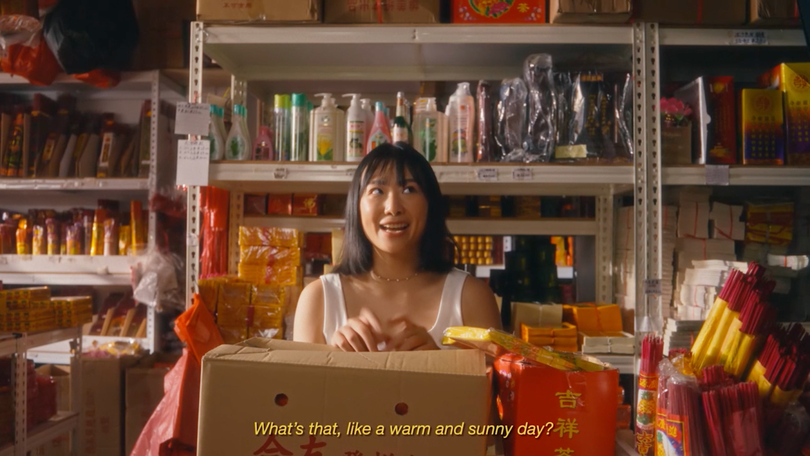
One thing I have noticed in independent movies is that their directors take their colour palette really seriously. It’s a commitment because they want to convey the message of their project in every way possible. Naturally, this includes colour themes, since colour theory is one of the easiest tools to learn and use in the production of a movie.
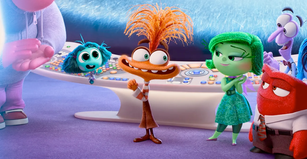
Carl Jung, a swiss psychatrist, stated that “colours express the main psychic functions of man”. Indeed, one could see red from anger, feel blue and green with envy. The most popular example for this phenomenon is in the movie Inside Out (2015) and Inside Out 2 (2024) both produced by Pete Docter, where personification of actual emotions have their own designated colour.
Another great movie that uses colour coding to tell a story is Star Wars (1999) by George Lucas, as the colour of the characters’ lightsabers represent their moral compass; red is bad, and green is good. We’ve been colour-coding how we feel and what we’ve experienced, giving themes, events, and even eras their own hue. Colours have become an international language of creativity and visual expression.
There are three main ways you can technically dabble with colours: hue, saturation, and brightness. First, you pick the hue, the colour itself. Then you can change the saturation of your hue; you can choose from a soft, muted colour to a vivid one. And lastly, the brightness of your chosen colour, which controls how light or dark you want your colour to be. By playing around with those colour wheels, you’ll be able to create a million different colours and therefore convey a large umbrella of emotions and themes, and can therefore shape the tone of each scene of your movie as you wish.
Your colour palette should be incorporated in every department, for instance your actor’s wardrobe, production design, and location. A calculated colour palettes give a movie an identity, and every detail shall emphasize it. Another example is a character’s wardrobe changing from muted greyish blues to vivid bright shades of yellow and pink can accentuate the improvement of a character’s mood that would have already been evoked in the storyline.
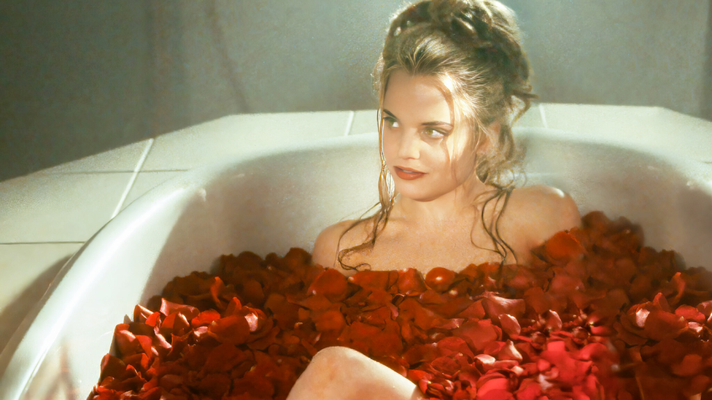
Often, independent movies come from a very personal place; new directors are attracted to films about their lives, childhood, or personal conflict, which frequently feature their culture. Colour palettes also carry a heavy cultural meaning in movies. In Chinese and Vietnamese films, the colour red is often prominent, usually symbolizing luck, celebration, and vitality. On the other hand, Western interpretation of the colour red usually gravitates around love, passion, or anger. This contrast shows that colour palettes are a perfect tool to highlight different cultures and traditional topics.
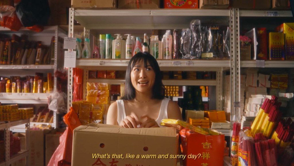
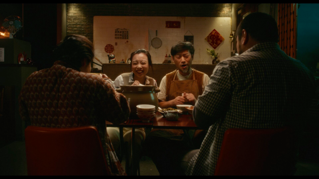
One can guess anything about a movie from its colour palette. Colours are used to express emotions, give environmental context, locate time, or give away the inner workings of characters. for instance, the short film Eat Up!好好吃饭 produced by Yuxin Cao and Denis Curnow, and was part of the All Asian Independent Film Festival selection 2025, a heartwarming sci-fi set in a world where food is 3D printed follows a father and a daughter bonding as they rediscover the lost art of cooking. the daughter is conflicted between two worlds, her father’s kitchen or her career in the 3D food industry, both illustrated by their own location. The producers chose two different colour palette to “try to separate the two locations and make a little bit difference between those two. […] And also giving different vibes to the audience.”
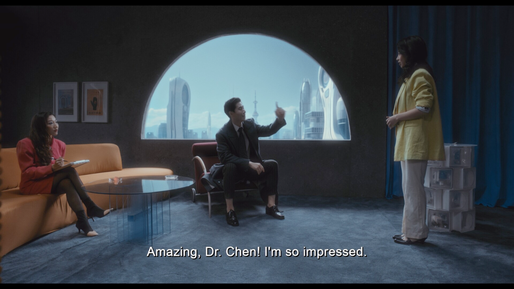
For the office, the producers used a triadic colour palette and a analogous one for the kitchen. “The office is more of a modern, futuristic kind of colour palette. But also we had a lot of inspiration from the retro futuristic.”, the office colour palette paints the engineering world, the girl’s career. “On the other hand, in the restaurant, we wanted to be more subtle, be more realistic.” An analogous colour palette is usually used to express harmony, and calm and here with the brightness turned so low, a feeling of coziness.
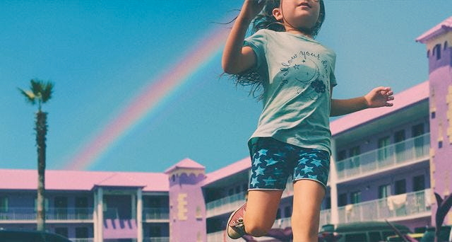
As much as using the right colours to give the mood to a scene is pleasing, consistency and progression of a chosen colour palette can let your audience understand what’s going on and follow your story as it develops. The progressive use of a specific colour throughout a movie helps follow the story and the evolution of certain themes, such as in Contagion (2011), where the green and yellow hues let you know this is a movie about a pandemic and how it spreads. Colours can separate perspectives and mood shifts. In The Florida Project (2017) the colours are bright and saturated, letting us know that the movie is from a kid’s point of view.
To use colour theory, you don’t need to elevate your budget. You simply need ideas, moodboards, awareness, and basic knowledge. It’s an accessible tool to master in order to give an identity to your movie and create a signature look, a look that your audience will appreciate and won’t forget. Colour, when used with purpose, can transform an ordinary image into something emotionally charged and unforgettable, making it an essential visual narrator for your story.
 English
Leave a Reply